Style and sourcing
Interior design colour schemes
Interior design colour schemes fail for one reason more than any other: they are chosen from a chart in a showroom and then installed in a house with completely different light. The colour did not change. The conditions did.
On this page
This page covers how a palette is built, why undertone matters more than colour, and what Australian light does to a scheme that was designed for a northern hemisphere photograph.
Material first, paint last
The most common mistake is picking a wall colour first and then trying to find a stone and a timber that agree with it. It is the wrong order.
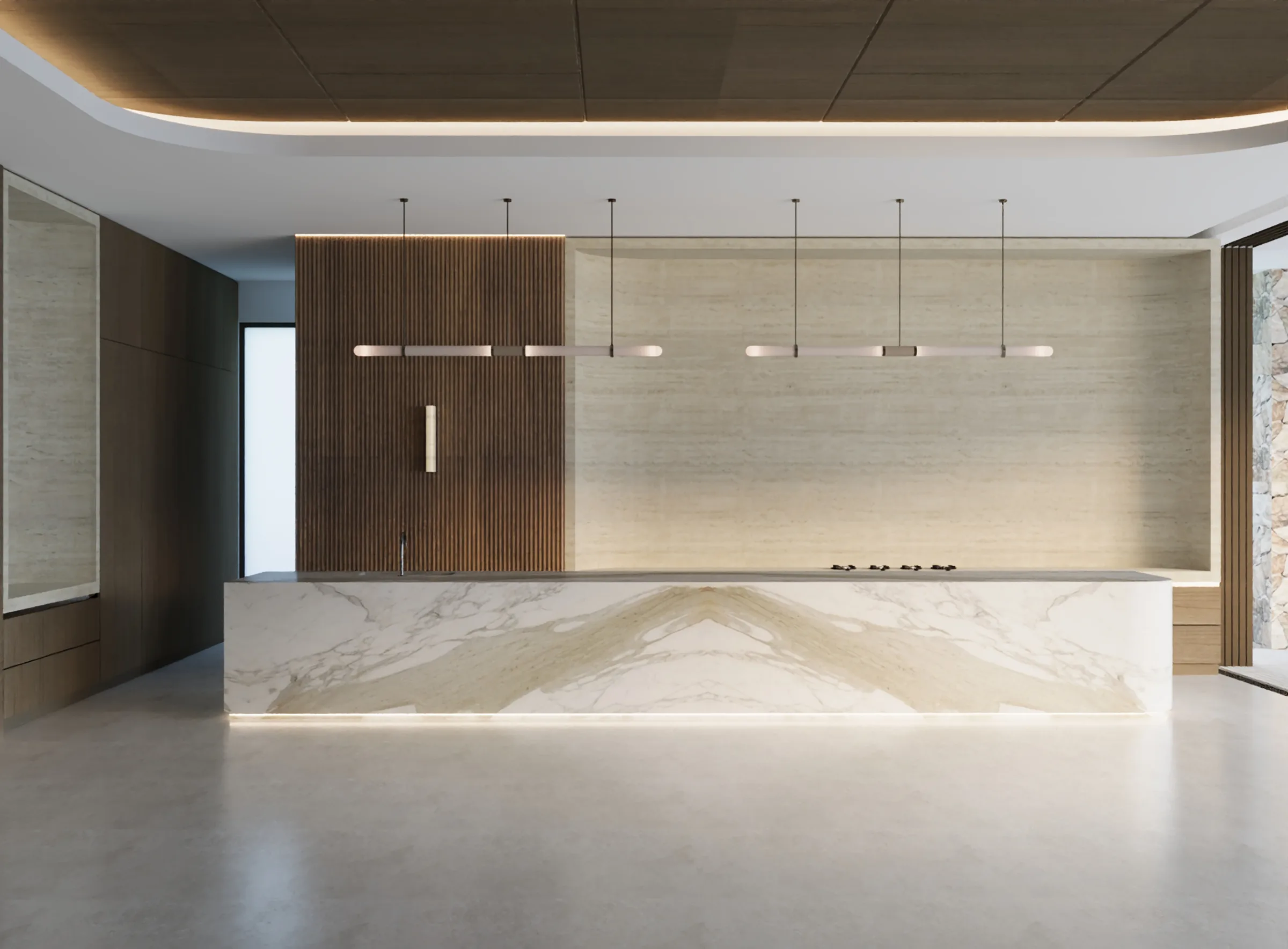
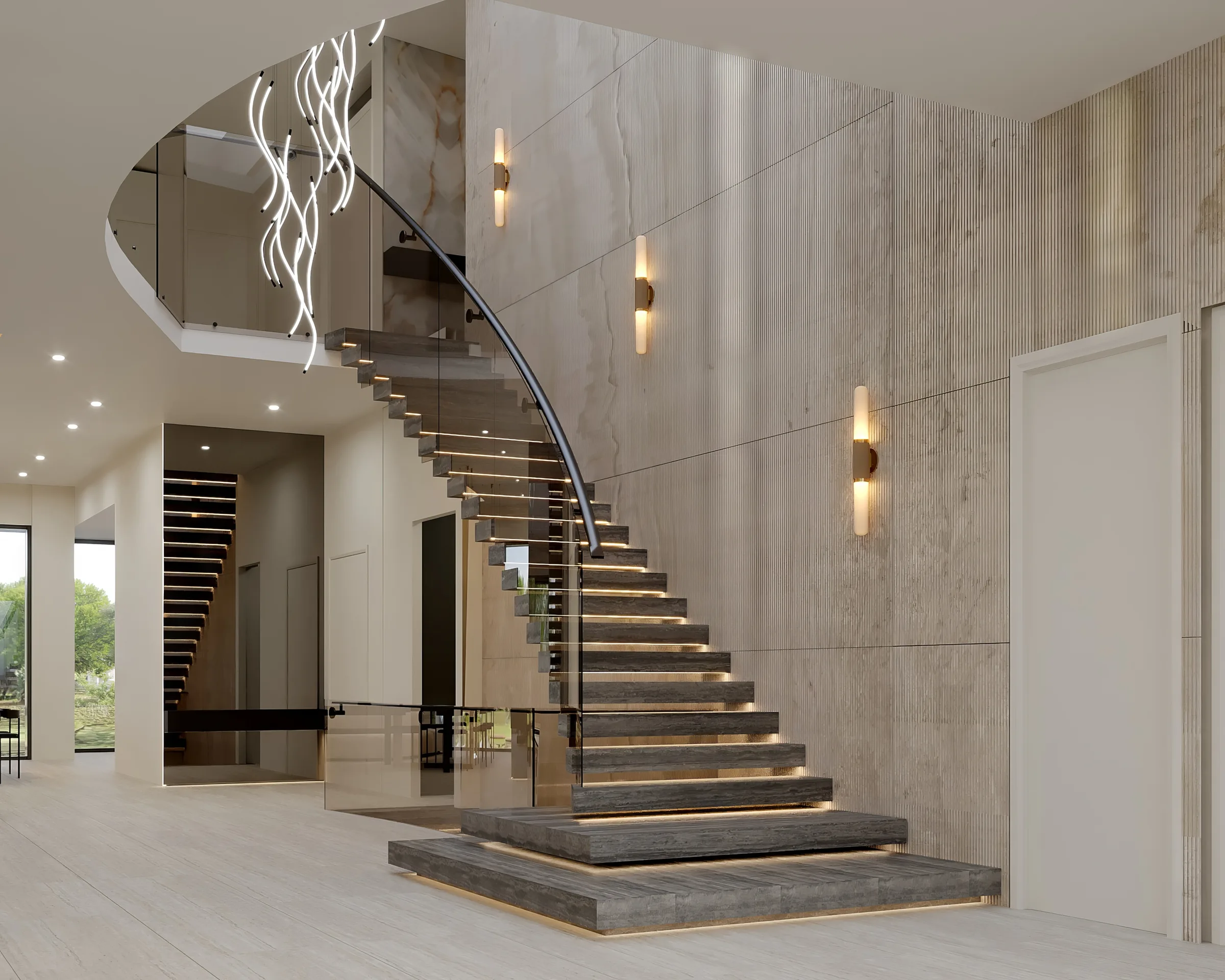
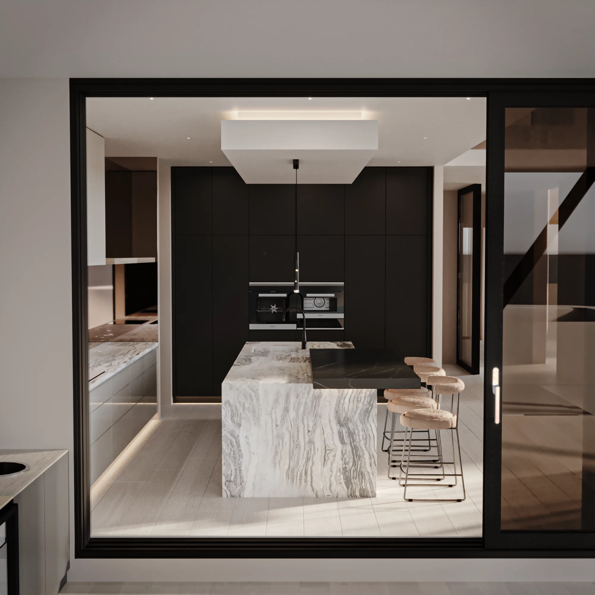
Stone, timber and tile come in the colours they come in. A slab has the veining it has. Paint can be mixed to any colour on earth. So the fixed materials lead, and the paint is matched to them last, because paint is the only element in the room with infinite options.
That single reversal solves most palette problems before they start.
Undertone matters more than colour
Two whites can both read as white on a chip and fight each other on a wall. One has a yellow undertone, the other a blue or grey one. Put them together and the warmer one looks dirty.
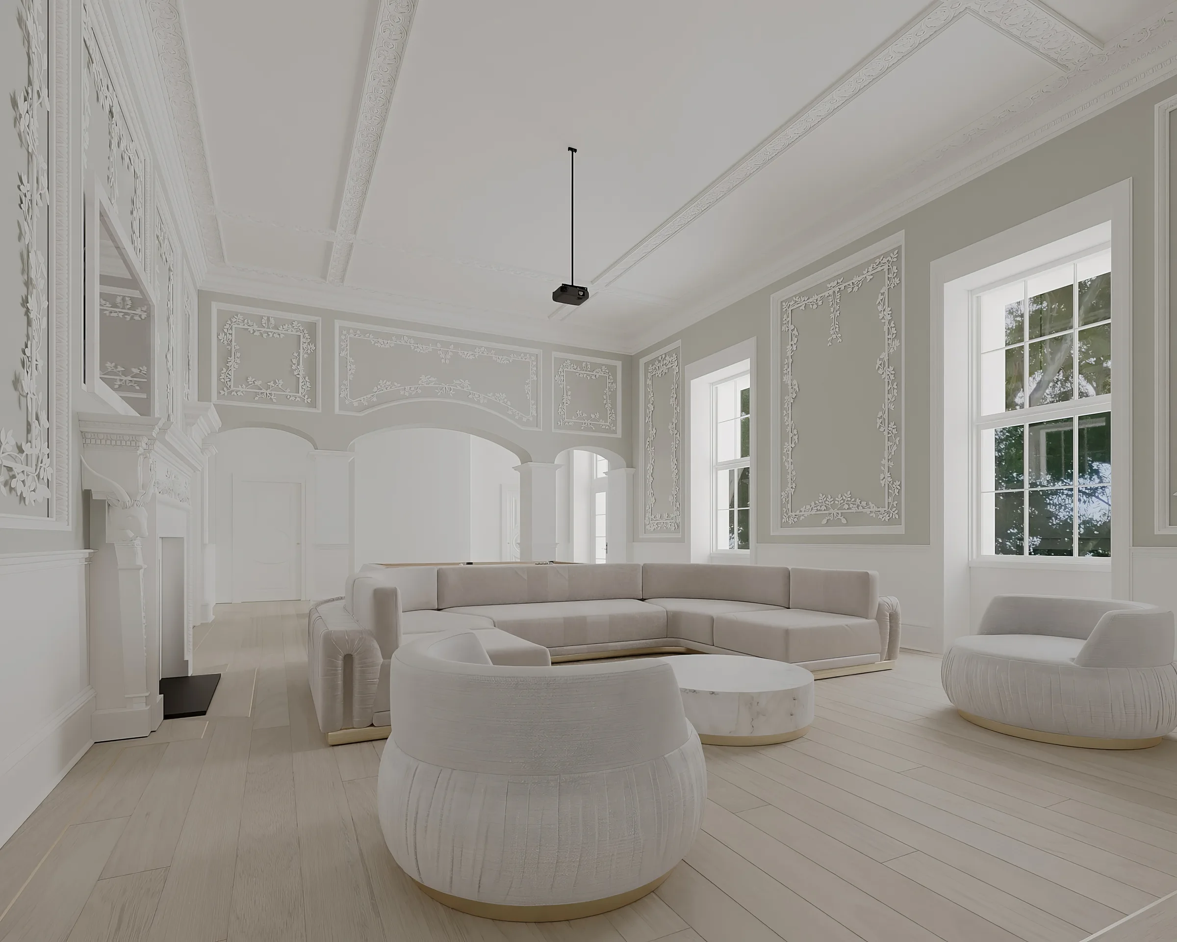
The same applies across a scheme. A warm oak floor and a cool grey stone will never quite settle, no matter how good each is on its own. Get the undertones consistent and a very plain palette reads as considered. Get them wrong and an expensive palette reads as an accident.
Hold a sample against the actual material it will sit beside. White paper makes everything look warm, so keep it out of the comparison.
Australian light is harder than the reference photo
Most interior imagery that circulates online was shot in Europe or North America, where the light is softer and lower in the sky. Australian light is stronger, whiter and more directly overhead for much of the year.
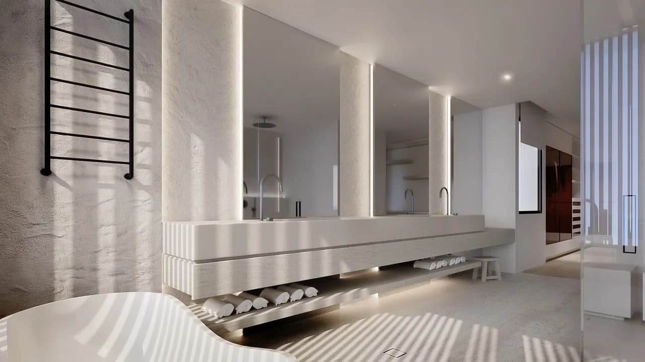
That does three things. Warm colours read hotter here, so an ochre that looks earthy in a Milanese apartment can look orange in Queensland. Cool greys go colder and flatter. And high reflectance whites become genuinely uncomfortable in a north facing room.
Near water it is worse again, because light bounces up off the surface and hits the ceiling. Coastal palettes usually need to be a step warmer and a step softer than the reference image suggests.
How the 60 30 10 rule actually works
The common version is sixty per cent dominant colour, thirty per cent secondary, ten per cent accent. It is a reasonable starting proportion and a poor finishing rule.
What the rule describes is hierarchy. A room needs something that carries it, something that supports, and something small that does not belong to either. The percentages matter far less than the fact that the three roles are distinct. Two colours in equal measure read as indecision.
Test in the room, over a full day
Paint a large sample directly on the wall and look at it in the morning, at midday and under the lights you will actually use at night. A2 is the minimum useful size; anything smaller is dominated by the colour around it.
Do the same with stone and tile. Take the sample home and put it on the floor where it will live. Showroom lighting is designed to sell stone and it is not the lighting in your house.
Where a palette should be restrained
Whole home schemes work best on a narrow palette carried through, usually three or four materials with one or two accents. Texture and light supply the variation.
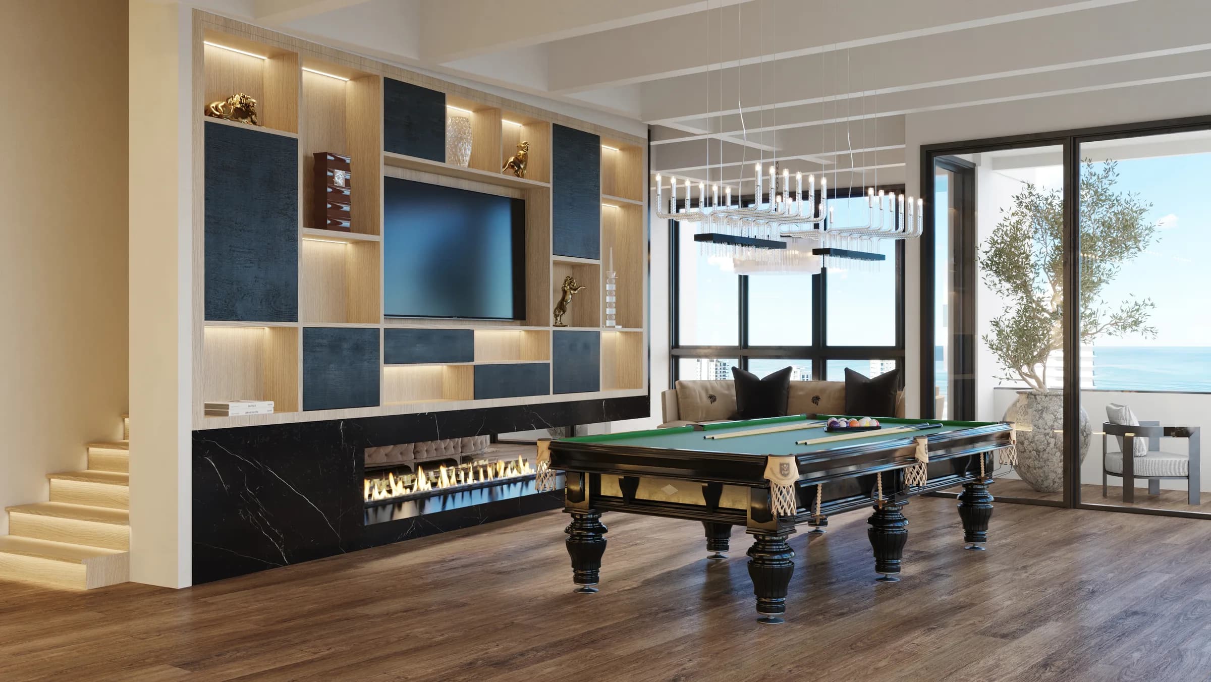
Rooms you occupy briefly can take more. A powder room, a bar, a cinema. These are the places to be bold, because nobody sits in them for four hours and they are cheap to change.
Related reading
Minimalist interior design covers the warm neutral approach in more depth, and marble vs travertine covers the two stones most palettes are built around. Coastal interior design covers what reflected light does to a scheme.
Frequently asked questions
How do you choose a colour scheme for a whole house?
Start with the fixed materials, meaning stone, timber and tile, because they come in the colours they come in. Match paint to them last, since paint has infinite options. Keep the palette to three or four materials carried through the house, and let texture and light provide the variation.
What is an undertone and why does it matter?
An undertone is the subtle colour bias sitting underneath a shade, usually warm yellow or cool blue and grey. Two whites can look identical on a chip and clash on a wall because their undertones differ. Consistent undertones are what make a plain palette look deliberate.
What is the 60 30 10 rule?
A guide suggesting sixty per cent dominant colour, thirty per cent secondary and ten per cent accent. Treat it as a description of hierarchy rather than a formula. What matters is that the three roles are clearly different, because two colours used equally read as indecision.
How big should a paint sample be?
At least A2, painted directly on the wall. Anything smaller is influenced by the colour surrounding it. Look at it in the morning, at midday and under your night lighting before deciding.
Do dark colours make a room feel smaller?
Not reliably. A dark room with good layered lighting often reads as larger and more enveloping than a pale room lit by a single ceiling fitting. What makes a room feel small is flat, even light and hard contrast at the edges, not the depth of the colour.